





The wood floor has been carefully chosen, the wall colour coordinated with the fabrics. Yet in the evening, the room looks different from what you expected. Lighting may be part of the reason: alongside colour temperature, colour rendering also matters.
The CRI rating helps you assess this characteristic of an LED. We explain what it means, where good colour rendering is especially worthwhile and what we look for at lightnox.de when selecting high-quality lighting.
1. What does CRI mean in LED lighting?
CRI stands for “Colour Rendering Index”. It describes how closely a light source renders test colours compared with a reference at a similar colour temperature. The usual rating on a datasheet is also called Ra.
The highest possible value is 100. The closer the rating is to this value, the smaller the average colour differences for the test colours assessed. CRI 90 does not mean “90 per cent of all colours are correct”. It is a comparative index.
Our starting point: For living spaces where materials and colours have been carefully selected, we recommend LED light sources with a CRI of at least 90. This is a lightnox.de selection guideline, not a universal requirement for every room.
2. Why does good colour rendering matter?
We see an object's colour through the light it reflects. The same fabric can therefore look different under different LEDs. Two lights may appear similarly bright and equally warm white, yet wood, skin tones or food can look different beneath them.
For carefully designed interiors, light quality deserves attention: warm wood tones, muted wall colours, natural stone and textiles should work together in the evening too. A high CRI is a useful starting point. On its own, however, it guarantees neither a beautiful lighting effect nor perfect reproduction of every individual colour.

3. CRI and Kelvin: What is the difference?
| Rating | What it describes | Example |
|---|---|---|
| Kelvin (K) | How warm or cool the white light appears. | 2700 K looks warmer than 4000 K. |
| CRI / Ra | How faithfully test colours are rendered compared with the reference. | Ra 90 scores better for colour rendering than Ra 80. |
| Lumens (lm) | The total amount of visible light emitted by the source. | More lumens mean a higher luminous flux. |
An LED with a colour temperature of 2700 Kelvin can have either CRI 80 or CRI 95. Warm white does not guarantee high colour rendering. Equally, a high CRI tells you nothing about how bright a light is.
For living spaces, a suitable warm white colour temperature combined with CRI 90 or higher is often a good choice. Read more about choosing a colour temperature in our guide What does light colour or Kelvin mean?
4. CRI 80, 90 or 95: Which rating makes sense?
| CRI / Ra | Our assessment | When is it useful? |
|---|---|---|
| 80–89 | Good colour rendering for many everyday tasks. | Where subtle colour differences are less important, such as a storage room. |
| 90–94 | High colour rendering; our recommendation for carefully designed living spaces. | Living rooms, kitchens, dining tables, bathrooms and dressing rooms. |
| 95 and above | A very close match to the reference for the test colours assessed. | Where subtle colour differences matter particularly, for example with art, fabrics or material samples. |
Do you always need CRI 95? No. CRI 90 or higher is a good foundation for many home lighting situations. Glare control, light distribution, dimming and suitable brightness matter just as much.
The limitation of CRI: The average does not include every colour
Ra averages eight test colours. Saturated red is not included; it has its own additional rating, R9. For demanding red and skin-tone rendering, check this value if the manufacturer provides it. Identical Ra ratings can therefore produce different colour impressions. Technical background on CRI assessment: NIST.
5. Where is a high CRI especially important?
Kitchens and dining tables
Food, worktops, wood and tableware come together here. Good colour rendering helps you distinguish these colours. We recommend CRI 90 or higher especially for worktops and above the dining table. Position and brightness must also suit the task so you do not work in your own shadow.

For advice on positioning pendant lights, see our guide to lighting your dining table.
Living rooms and interiors with natural materials
Wood, stone, leather and coordinated fabric colours often depend on subtle nuances. Carefully chosen colour rendering is particularly worthwhile in minimalist rooms with a small material palette. Whenever possible, assess samples under the lighting you actually plan to use.


Bathrooms and dressing rooms
At the mirror, skin tones and make-up matter; in the dressing room, it is the colour of your clothes. We recommend CRI 90 or higher here. A high rating does not replace even facial lighting, however: a single ceiling spotlight can cast harsh shadows despite good colour rendering.

Art, retail displays and hospitality
Where paintings, fabrics, products or food take centre stage, colour rendering deserves particular attention. Demanding applications should consider further colour data and the specific visual tasks alongside Ra. The Wever & Ducré CRI guide lists food shops and museums among the examples with high requirements.
6. Wever & Ducré: High-quality lighting with high colour rendering
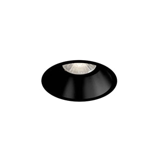
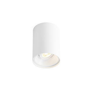
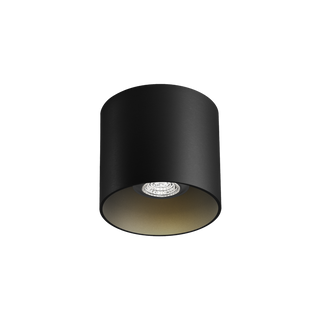
Wever & Ducré stands for high-quality architectural lighting with clean, distinctive forms. Another reason we value the brand at lightnox.de is the high CRI of many of its integrated LED models: numerous versions are offered with CRI 90 or higher, or > 90.
The manufacturer shows this rating, for example, for TRACE pendant lights and DEEP petit LED recessed spotlights. Its catalogue tables list the value next to the luminous flux under “lumen | cri”. Always refer to the datasheet for your chosen version. How to find CRI in the manufacturer's catalogue.

Important for GU10 / PAR16: In a fixture with a replaceable bulb, colour rendering is determined primarily by the LED bulb fitted. A Wever & Ducré fixture therefore does not automatically achieve CRI 90 simply because of its brand. Choose the bulb accordingly too.
If you want to combine refined design with high light quality, explore the collection on our brand page. We will be happy to help you understand the CRI rating and other characteristics of your preferred light.
Discover Wever & Ducré at lightnox.de
7. What should you check when buying?
- Check CRI / Ra: We recommend at least 90 for living areas with demanding colour requirements.
- Look at the right version: Distinguish between an integrated LED module and a replaceable bulb.
- Choose the colour temperature deliberately: Select Kelvin to suit the room and the atmosphere you want.
- Consider the lighting effect: Check brightness, beam angle, shielding and dimmability.
- View materials together: Compare wood, fabrics and wall samples under the intended lighting.
For us, Architectural Lighting means bringing the fixture, the room and the lighting effect together. Good colour rendering is an important aspect of quality, especially where furnishings and materials have been chosen with care.
8. Frequently asked questions about CRI
Is CRI 80 bad?
No. CRI 80 can be sufficient for many tasks. If natural-looking material colours and skin tones are particularly important to you, we recommend CRI 90 or higher.
Is CRI 90 brighter than CRI 80?
No. CRI describes colour rendering. The lumen rating is relevant to the amount of light emitted.
Can warm white light have a high CRI?
Yes. An LED at 2700 or 3000 Kelvin can achieve very high colour rendering. Colour temperature and CRI should be considered separately.
Do all Wever & Ducré lights have a CRI above 90?
Many integrated LED models offer high CRI ratings. Always check the specific version. With GU10/PAR16 fixtures, the rating depends on the bulb fitted.
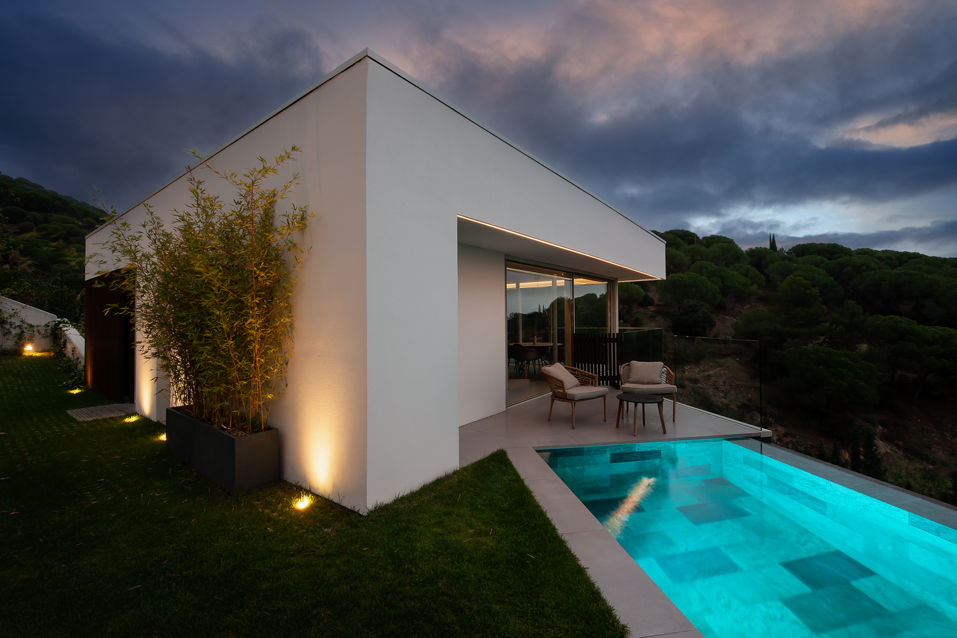
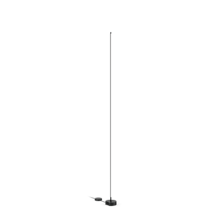
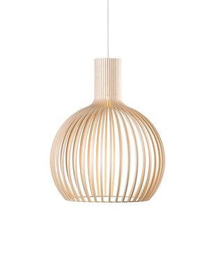
The interior photographs show application examples. A specific CRI rating cannot be determined from a photograph.


Leave a comment
This site is protected by hCaptcha and the hCaptcha Privacy Policy and Terms of Service apply.